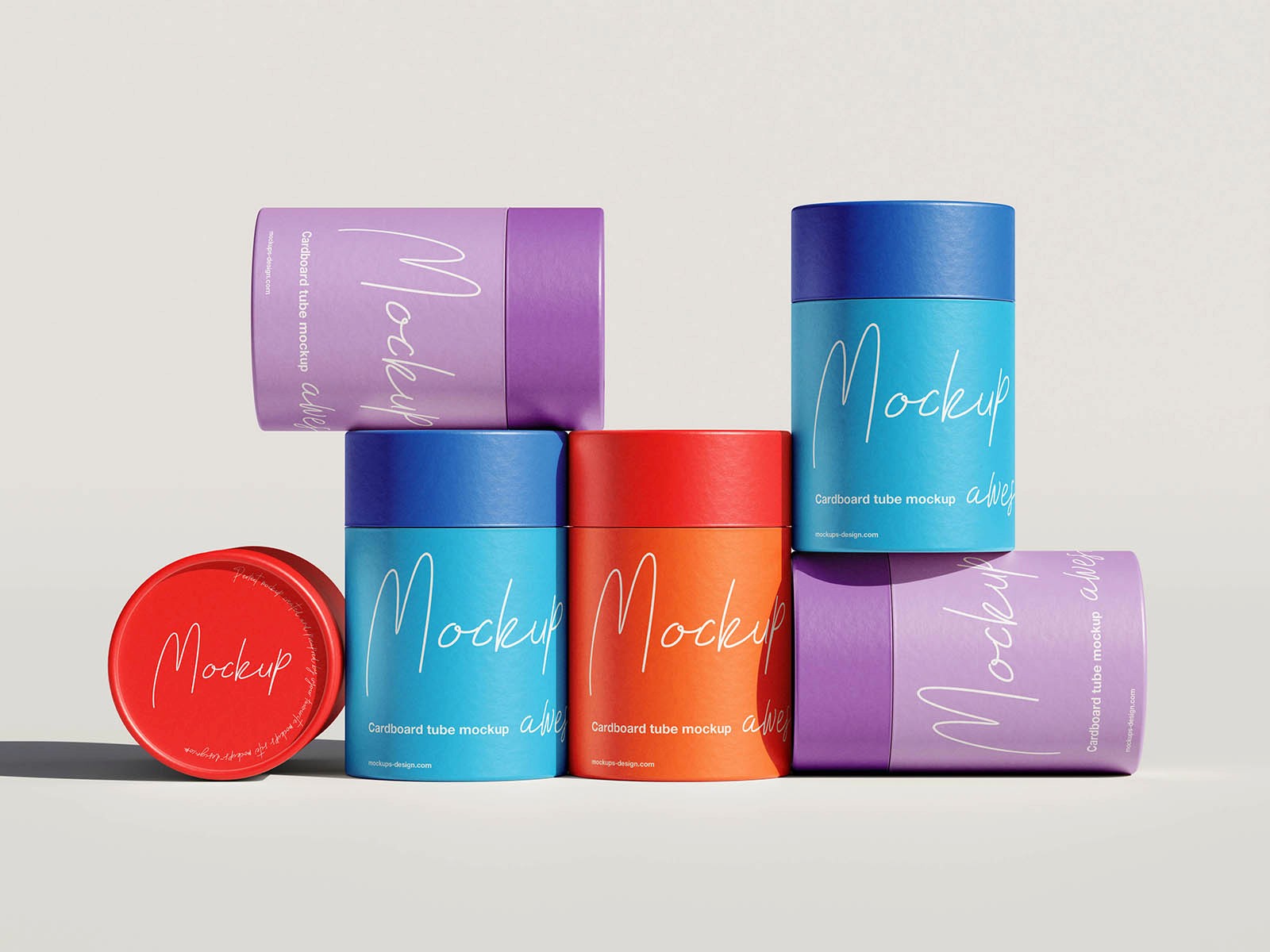
Bloom
Minimal skincare packaging designed to feel clean, natural, and undeniably premium on shelf.
Service
Packaging Design
Year
2025
Timeline
3 Weeks
Client
Verde


Project overview
Bloom approached us to redesign their skincare packaging ahead of a major retail expansion, aiming for stronger shelf presence. Their existing boxes felt generic and didn't reflect the brand's natural, minimal philosophy, so we were brought in early. We created a packaging system balancing sustainability, tactile quality, and shelf impact, making Bloom instantly stand out beside louder competitors. The first week was spent studying ingredients, customers, and retail context before sketching a single visual, keeping every choice strategic.
Project process
We began with a discovery call, mapping Bloom's ingredients, packaging constraints, and target customer before any sketches began. From there we explored structural concepts, material options, and print finishes, narrowing down to three strong directions for review. After feedback, we refined the chosen direction, adjusting typography, color, and texture until the packaging felt effortless on shelf. The final stage focused on production-ready files, print testing, and mockups, ensuring the design translated perfectly from screen to shelf.
Final result
The final packaging system launched across Bloom's entire skincare line, giving every product a consistent, premium, and recognizable presence. Retail buyers responded immediately, with Bloom securing three new store placements within the first month after the redesign launched. Customers noted the packaging felt more trustworthy and premium, which directly supported a noticeable lift in repeat purchase rates. Bloom now uses this packaging system as the foundation for every future product launch, keeping the brand consistent as it grows.